Brand system
Crewix — the construction workforce network.
Core belief: construction shouldn’t depend on who you know. It should depend on what you can do. The identity is direct, fair and construction-led: flat colour, structural geometry, plain language, no hazard stripes and no agency gloss.
Logo concept
An open C meets a structural X. The open C is construction's closed networks being opened up; the X is two paths meeting — capable people and the right projects. The chamfered joints read as connected structural members without drawing a building, hat or tool.
Primary horizontal lockup
Standalone symbol
Wordmark
App icon (square)
Applications
The mark holds in one colour, reversed on ink, and at interface sizes.
Reversed — white on Crewix Ink
Monochrome — ink
Monochrome — steel (single colour print)
Clear space — minimum of one X-width on all sides
Minimum sizes — symbol 20px, lockup 96px wide
20px
24px
96px lockup
Colour
Flat colour only. Green is reserved for available, verified and successful states — never decorative body text. No construction yellow, no gradients.
Crewix Ink
#0D2235
Primary brand, headings, dark surfaces
Crewix Blue
#2F6BFF
Primary action, the X in the logo
Crewix Green
#19A97B
Available, verified, successful only
Concrete
#F4F6F7
Page background, quiet sections
Steel
#65717D
Secondary text
Line
#DCE3E8
Borders and dividers
White
#FFFFFF
Surfaces and reversed marks
Near Black
#121A22
Long-form body text
Typography
Inter for the Latin interface and the wordmark foundation, Noto Sans Devanagari as the Hindi fallback. Sentence case, strong but not oversized headings, compact line lengths.
Display / H1 · 48px · semibold · -2% tracking
Construction shouldn’t depend on who you know.
H2 · 32px · semibold
Your reputation should follow you.
Body · 16–17px · regular · Near Black
Crewix helps construction workers make their experience visible and helps contractors find capable people beyond their existing contacts.
English
Good at what you do? Make it visible.
Shqip
I zoti në punën tënde? Bëje të dukshme.
Română
Te pricepi la meseria ta? Fă-o vizibilă.
हिन्दी
अपने काम में माहिर हैं? इसे दिखने दीजिए।
Multilingual proof line
English Shqip Română हिन्दी
Components
8–12px radii, 1px borders, minimal shadow, large touch targets, visible focus rings.
Buttons
Buttons on ink
Inputs and search
Tags and states
Icon style — outlined, 1.75 stroke, 20–24px
Language control — always visible, never buried
Worker passport card
Professional workforce passport, not a social profile: photo, trade, location, verified qualifications, availability, project history and a 'would rehire' proof signal. No star ratings.
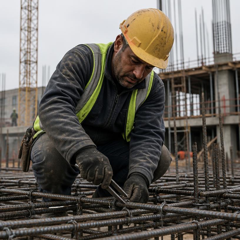
Arben Krasniqi
Steel fixer · RC frame
Manchester · will travel
Verified qualifications
Project history · 11 years on site
- Would rehire
Deansgate Plot C
Steel fixer · 2024–2025
- Would rehire
Trafford Logistics Hub
Steel fixer · 2023
Salford Quays Frame
Steel fixer · 2022
6 of 7 contractors would work with him again
Verification and availability states
- VerifiedDocument or contractor check completed. Green only here.
- PendingSubmitted, not yet checked. Neutral, never red.
- ExpiredTicket out of date — shown with expiry date.
- AvailableOpen to work now.
- From 18 AugAvailable on a future date.
- Would work with againContractor-confirmed rehire signal — the only reputation metric.
Photography art direction
Documentary and candid. Real people actively working across groundworks, RC frames, carpentry, steel fixing, concrete finishing, engineering and supervision. Mixed ages and backgrounds, real PPE, real sites. Never spotless models with folded arms.
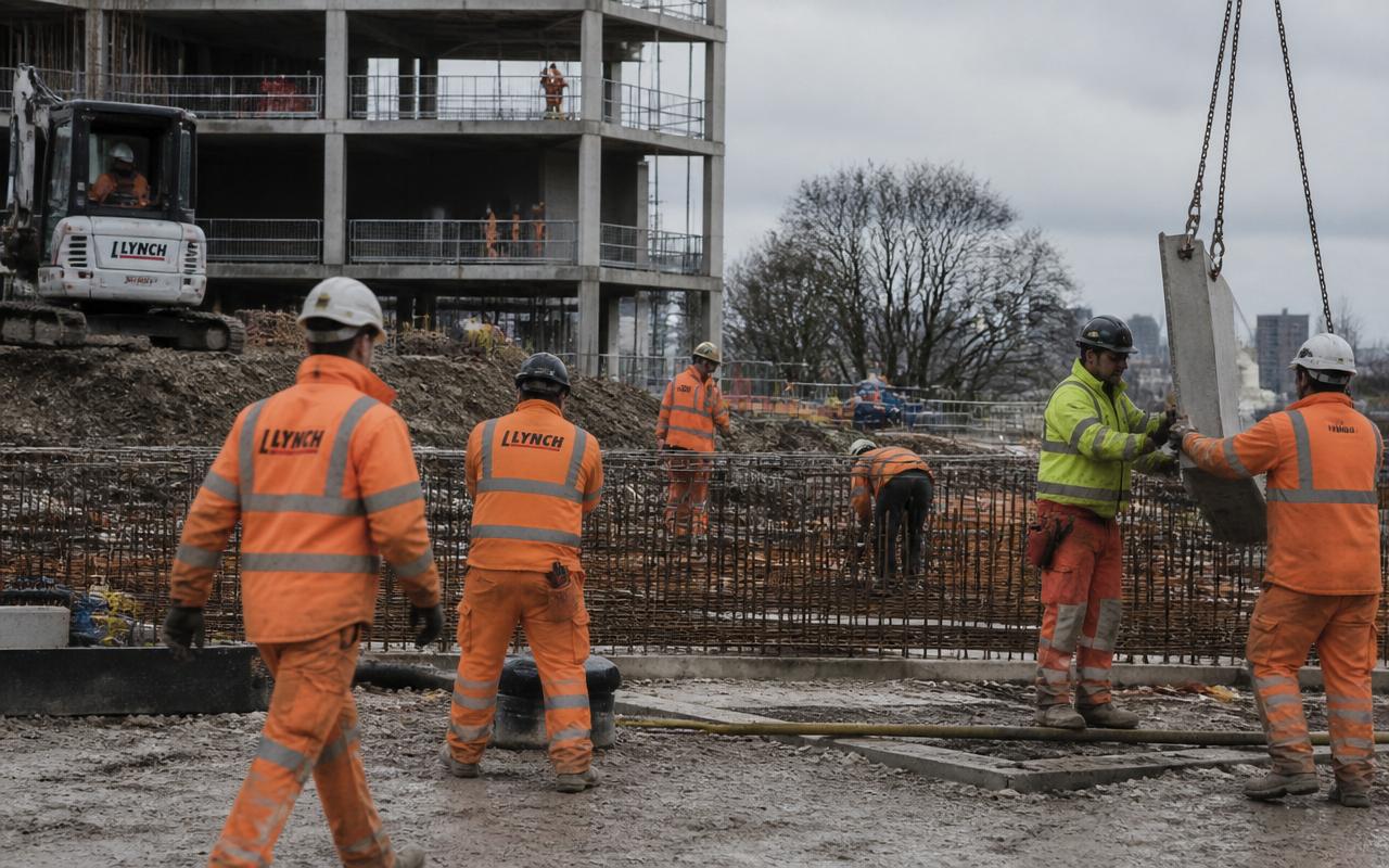
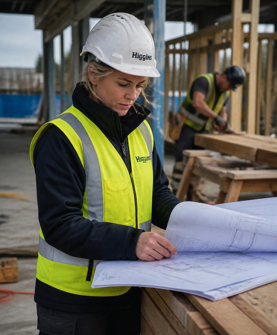
Overlay example — contrast preserved
Accessibility
The system is built to meet WCAG 2.2 AA in normal use.
Contrast
Ink on white 14.9:1, Near Black on Concrete 14:1, white on Crewix Blue 4.6:1 at 16px+. Steel is for secondary text only, never below 14px on Concrete.
Never colour alone
Availability and verification always pair colour with an icon and a text label.
Focus and targets
Crewix Blue focus ring with offset, 44px minimum touch targets, full keyboard operation of the language control.
Language
lang attributes on every non-English string so screen readers use the right voice, including Devanagari.
Motion
Fades and connector-line drawing only, under 500ms, disabled under prefers-reduced-motion.
Plain language
Short sentences, no recruitment jargon, translatable copy without idiom.
Do and don't
Do
- Lead with ink, white and concrete; use blue for action.
- Keep the X the accent — one blue moment per composition.
- Show evidence: verified tickets, real projects, rehire signals.
- Write in sentence case and plain language.
- Give the language control a permanent, visible home.
Don’t
- No hazard yellow and black, chevrons or warning tape.
- No hard hats, cranes, bricks or cartoon tools in the mark.
- No gradients, glass panels, neon or heavy shadows.
- No star ratings or scores anywhere.
- No stock photos of clean workers posing with folded arms.
- No tagline locked into the logo.